 by Mark Harris Aug 8, 2018
The key to the supportability of today’s networks is an accurate network diagram, not a picture of what it looked like 3 years ago, with a bunch of handwritten changes scratched in, but a real-live network diagram that shows every minute detail of how the network is operating. And it’s not a canvas to make beautiful artwork for the sake of art, but network diagrams make everything easier when it comes to adds/.moves/changes and the litany or remediation types we see every day. I’ve spent countless hours arranging lines just right, and I’ve spent many bleary-eyed evenings searching online for just the right Visio icon. Network diagrams don’t have to be works of art – they have to be useful…. and accurate!
The first thing I look for when kicking off a network project with a customer is a current network map. I’ve seen some that look like building schematics crammed with so much information they’re almost unusable. I’ve also seen some that are clearly meant for someone outside of technology because of how pretty they are, though lacking any real information. And what I usually find is the prettier they are, the more out of date they are!
Tip #1: Network diagrams don’t have to be works of art – they have to be useful, comprehensive, and accurate.
Often, cramming as much information as possible onto a diagram comes at the expense of clarity, and making diagrams overly simple comes at the expense of usefulness. In my experience, network engineers prefer to create diagrams that focus on one or two areas at a time rather than create one overwhelming masterpiece. And due to the scope of most networks, this critical need is simply not addressed very often. As I said above, I have seen many a map that are 3+ years out of date.
1. Starting with the global view, WAN Topology
First, a common way to diagram a network is by the WAN topology. This sort of diagram might be relatively simple and include only mission-critical hardware such as core switches and WAN routers. It tends to focus more on site-interconnectivity rather than the many layers of abstraction a modern network may have. It largely ignores the protocols, overlays, and underlays. It ignores the bi-directional and logical path calculations.
Though this kind of diagram may not have every single network device, IP address, and switch port on it, it could be a very useful view for a quick-glance understanding of an overall topology (if only it was accurate). Often this is the only type of diagram your TELCOM organization has, so if it were accurate and comprehensive, it would be an ideal resource for the support of remote users, data center interconnect (DCI) and public cloud application support groups.
Especially in a multi-site organization using route redistribution, having an accurate map that accurately displays the routing topology and paths could be much faster than logging into individual devices one at a time. Organizing a network in this way is important to understanding traffic flows and how information propagates throughout a WAN (if only it was accurate).
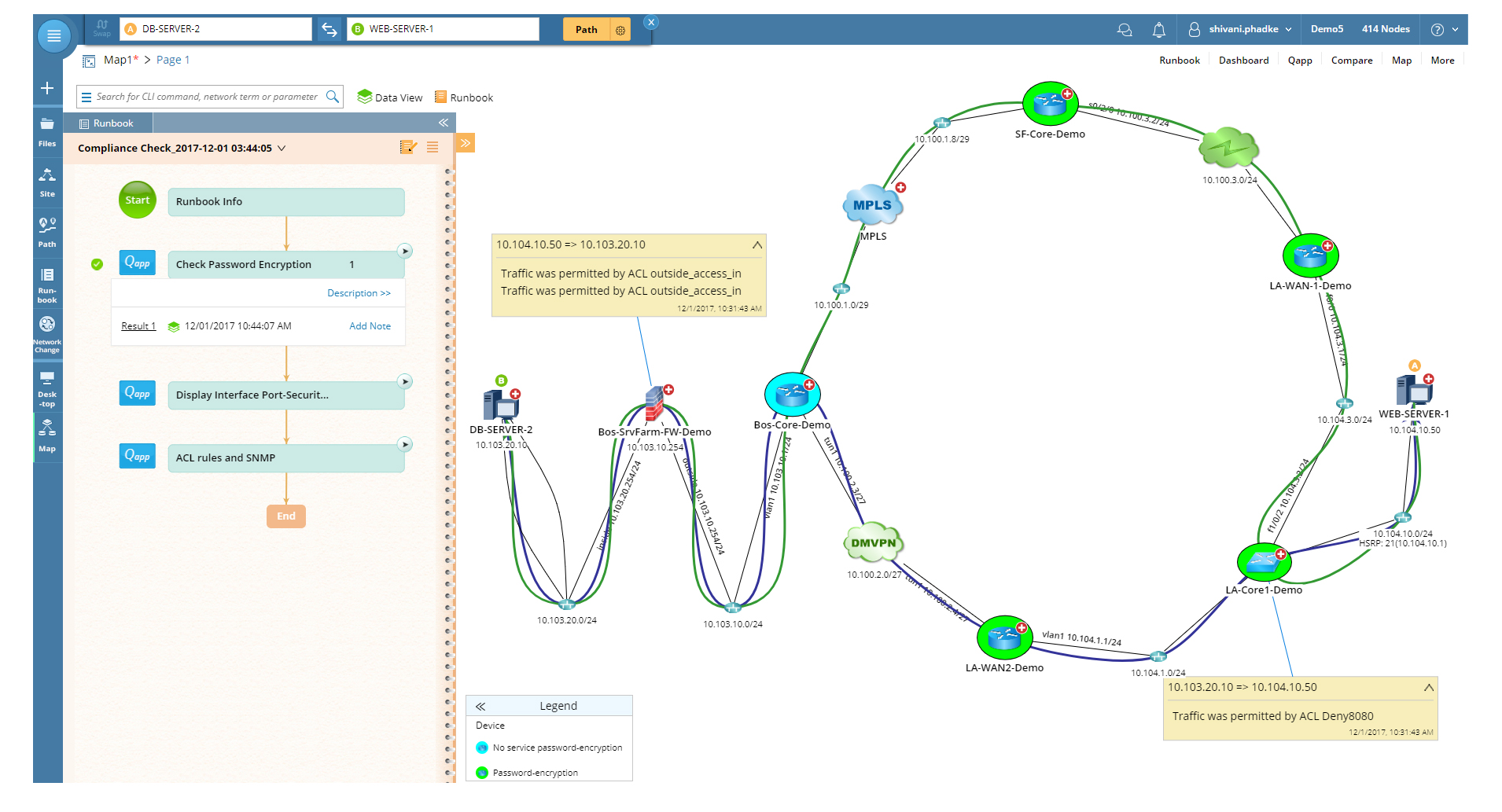
Take a look at the WAN map below generated by NetBrain Next-Gen. It’s a simple overview of WAN routers running OSPF for inter-site connectivity. On this map, we focus on WAN routers, OSPF areas, route redistribution, and so on. Notice the amount of detail? (And to help position this a bit more, it was generated in real-time, based on NetBrain’s real-time digital twin technology).
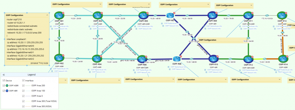 ABR and ASBR devices are highlighted by color; interfaces are color-coded by area number; OSPF configurations are annotated as device notes, and OSPF table data is embedded for each device.
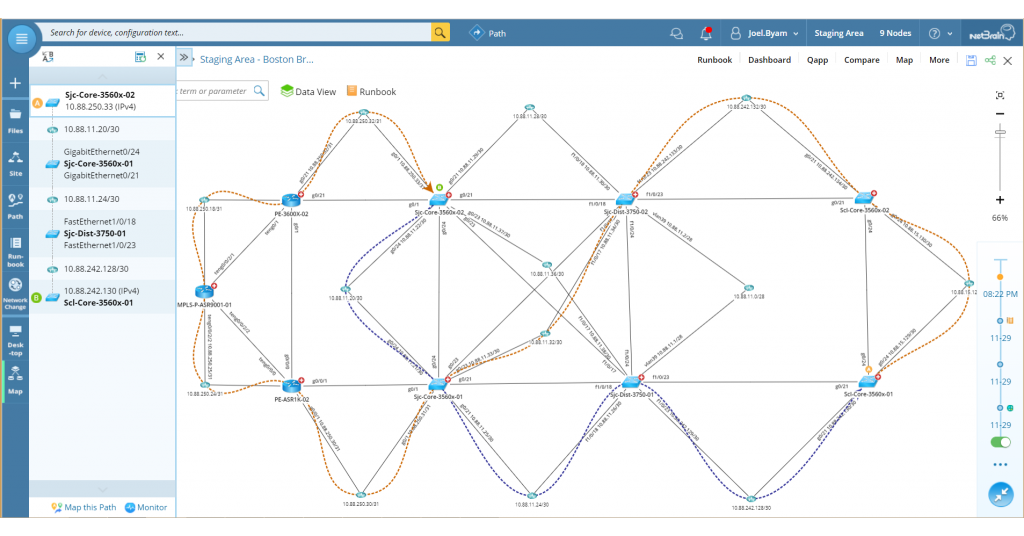
Note that with NetBrain’s Dynamic Map, nothing is static, and nothing is beyond your reach, from edge to cloud and everything in between. In this example, when we zoom in on the map we can select a link or a specific router, examine the configuration of a specific device, and layer our map any way we like. This is all real-time information available through NetBrain Next-Gen and at an engineer’s fingertips without having to stitch together device by device details manually.
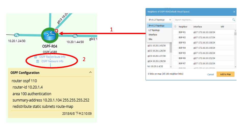 1. Clicking on a device icon reveals more information — L3 topology, OSPF neighbors, and more.
2. Clicking on a link discloses specifics such as redistribution parameters and OSPF neighbor information.
Tip #2: Accuracy is everything. The more detail you have available at your fingertips, the faster problems can be resolved.
2. Physical Topology Still Matters, but we have all kinds of overlays that change the picture entirely.
A second way to map a network is by physical topology. In this case, it isn’t the routine processes an engineer is necessarily concerned with, but the physical layout of devices, cables, and interfaces. Though less glamorous than a WAN diagram, a map of a network’s physical topology is priceless when working in the trenches of network closets and data center racks. Seldom are these well-labeled parts of the network, and even rarer is having an accurate diagram of this mission-critical aspect of the infrastructure. (Again, accuracy is what matters)
Tracing a layer 2 path through a network means knowing what interfaces switches use to connect to each other and what switch is the spanning-tree root bridge for a particular VLAN. Especially in a data center where there is an incredible amount of east-west traffic, layer 2 connectivity and actual physical device rack locations are extremely important to keep all the blinking lights on.
In the screenshot below, notice how we can see an entire FabricPath topology including interfaces and port channels.
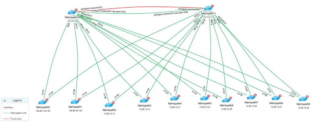 FabricPath configuration is annotated as a device note, and FabricPath route table is displayed as a device label — both accessible with a single click.
This is extremely important information when working in SDN and data center networking, and a NetBrain Next-Gen Dynamic Map that provides this data accurately is absolutely critical when making changes such as adding devices, moving virtual machine hosts, or migrating applications.
When we zoom into the VTP map below we can see individual switches, critical hosts, interface names, and trunks. Because this map is dynamic, like with the OSPF map above, we can drill down into specific devices with one click and gather physical layer and layer 2 information very quickly.
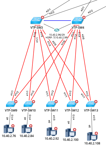 Drill down into the Dynamic Map to get virtually all VTP physical layer and layer 2 information instantaneously.
3. The Real-Time “Live” Network Map is Here!
Most engineers would be thrilled to have a map of their infrastructure that was only a month or two old. What about giving them a map that was a minute or two old? How would they feel about that? And what if that map included overlays, traffic flows, and link utilization? I’ve dealt with this in the pharmaceutical and financial industries in which regulatory bodies required we keep updated flow diagrams for audits. In fact, we were required to keep normal state and failed state diagrams for all our data centers and WAN paths.
This type of map is difficult to create manually because it means logging into a variety of devices to check routing information in order to understand real-time traffic flows and link utilization. However, a dynamically created map of live traffic flow that updates itself periodically can make this requirement much easier to meet- and one of the key tenets of the NetBrain Next-Gen solution. Try answering some of the following questions with outdated or incomplete maps:
- What happens when link A goes down?
- How long will it take for BGP to reconverge if router B goes down?
- What countries does our company’s intellectual property flow through?
- How can I tell when the upstream and downstream paths are different?
 Dynamic Maps showing how traffic flows at any given moment are invaluable in demonstrating network compliance.
These are typical questions I have had to answer when auditors stopped by, and NetBrain’s Dynamic Maps that can speak to network devices, as well as third-party tools to gather this information programmatically, can save tremendous time and ensure accuracy. Creating this kind of map from scratch and by hand means it’s error-prone and static. It likely doesn’t reflect the live network closely enough to be reliable.
4. The Campus Map, Virtualized Connectivity Looks Different
Another type of network map is referred to as the campus map and is described as a physical underlay that is dynamically carved out for business applications by the various VLAN and other overlay technologies. It contains all the VLANs and relevant layer 2/3 information including the location of gateways and NAT devices. This is probably one of the most common network maps I deal with, and for campus networks, it makes complete sense. However, I rarely trust them when I’m given one at the beginning of a project. (They just aren’t very accurate due to the rate of change in campus environments).
Traditional campus maps are usually created by network administrators, often part of a very small team, managing a variety of environments. Their network map, then, reflects the task they were working on at the time they created it — which means they aren’t truly data-driven and reliable. It assumes a network admin logged into dozens if not hundreds of devices one at a time and accurately captured all the information. And over time, these maps get even less accurate but rarely are they abandoned because the (naive) belief is these old dated maps are better than nothing. (not true)
I need something 100% accurate to reduce my MTTR. Period. When I’m swapping out a LAN core, I want to know about every VLAN in the organization including VTP information, the spanning-tree root bridge, and simple layer 3 information such as gateway IPs and subnet masks. I want to know where all the VLANs are on the campus and where their gateways live.
 A useful campus map includes up-to-date data that enables you to decode and visualize the network for the job at hand.
An accurate campus map gives engineers the ability to get their network bearings quickly without having to log in to many devices. Doing it manually means the map is likely incorrect or out of date. A campus map that’s dynamically created (Like that of NetBrain) provides exactly what most network administrators and network engineers like me crave when we start a new project: something thorough, something current, and something trustworthy.
5. Open Ticket Status
Finally, the fifth type of network map displays open tickets related to network devices. This map doesn’t highlight traffic patterns or routing domains, and it doesn’t showcase rack elevations in a data center; however, it does allow an engineer, working in a network operations center, to immediately see if there is an issue with a device without having to wait for helpdesk tickets to start pouring in.
In the image below we can see how an incident can be displayed on NetBrain’s Dynamic Map. Instead of helpdesk tickets from end users, this sort of map allows engineers to click on a router and immediately drill into the problem without guesswork and without wasting time. After I left the helpdesk, I spent some time as a NOC engineer which required me knew what was going on with devices so that I could resolve issues as quickly as possible.
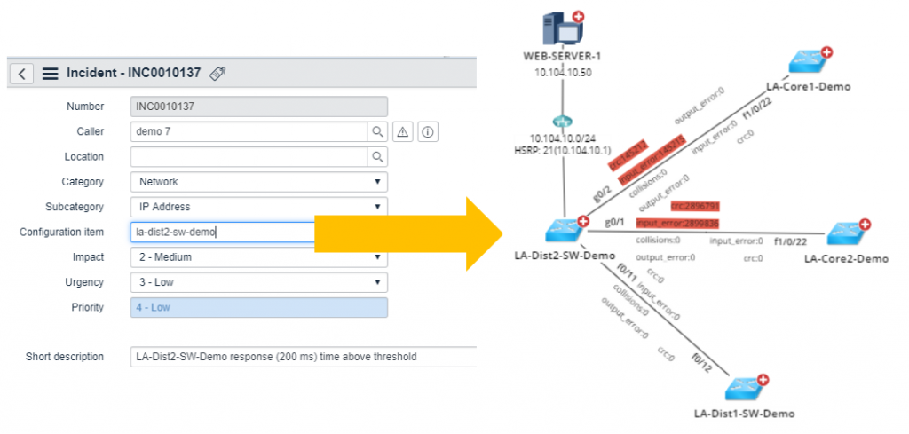 A diagram that maps the network by open incident tickets enables NOC engineers to immediately see what’s going on with problem devices.
Today, as a field-based network engineer, I work on networks I’ve never seen before and for which I have no documentation. The biggest hurdle for me is rarely the technology I’m configuring — it’s usually getting my bearings on the network and seeing what is in place, in real-time. Historically that can take days, and often I find myself confused by multiple generations of old diagrams, none of which have sufficient information or are in many places are just plain wrong.
I don’t need any beautiful artwork, and I’m not impressed with really cool Visio icons. I need a network map that is useful, and that means a map that’s dynamic and data-driven. I need NetBrain Next-Gen. Job done.