Define Chart Settings of ADT View
How Chart is shown in the view is defined under the Chart tab. After Table settings are defined, switch to the ‘Chart’ tab to continue to define what summary data will be illustrated by chart and select a chart style.
Enable Automation Summary Chart: Select/deselect the Enable Automation Summary Chart checkbox to control whether a chart will be displayed in the view. This feature is enabled by default. 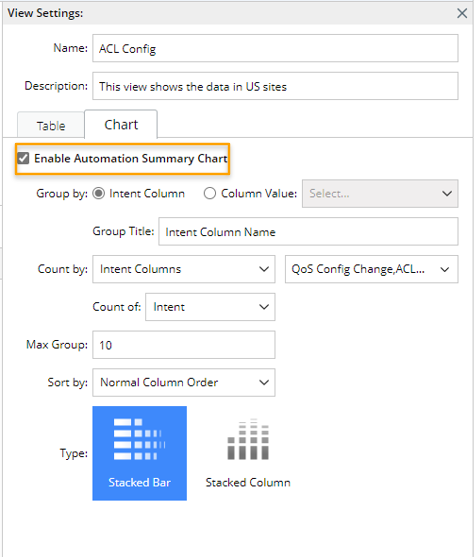
In the following part, Chart Settings will be illustrated according to the UI changes by three use cases.
Chart Settings - Use Case 1
Follow the steps below to define the Chart settings for Use Case 1: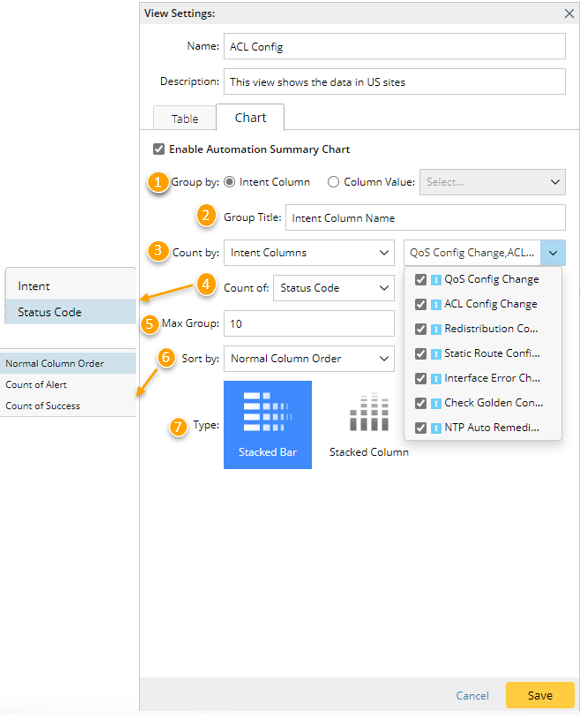
- Group by: in the Group by section, select the 'Intent Column' option. With this option being selected, all the intent columns selected under the Table tab are included in the chart, each intent column forming one group in the chart.
- Group Title: In this section, provide a group title, which will be shown near the vertical axis of the Chart. The default group title will be 'Intent Column Name' when the chart data is grouped by intent column, and you can modify the group title.
- Count by: In this section, define how the data in each group are counted by selecting some intent columns to be counted.
- Count of: In this section, further choose what will be counted for each of the selected intent columns. in this use case, Status Code is selected, which means the total number of status codes for each group will be counted based on the intent columns selected in step 3.
- Intent: Count the total number intents in each intent column group.
- Status Code: Count the total number of status codes in each intent column group.
- Max Group: Define the max number of groups presented in the Chart (default value is 10). For example, if the value is set to 9, and 12 groups are formed based on the settings in steps 1-4, then only the first 9 groups will be shown in the Chart.
- Sort by: Choose a way of arranging of order of the groups in the Chart. In this use case, Normal Column Order is selected, which means that the groups in the chart are arranged in the column order in the original ADT.
- Normal Column Order: Arrange the groups in the order of intent columns in the original ADT.
- Count of Alert: Arrange the groups by the total number of alert status codes in descending order.
- Count of Success: : Arrange the groups by the total number of success status codes in descending order.
- Type: Choose a suitable Chart style to present the summary data.
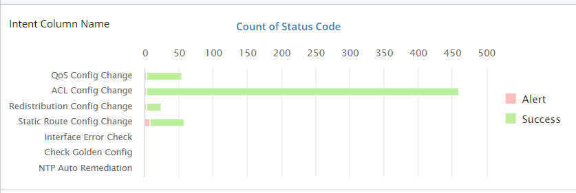
- Click Save, then check the chart shown in the ADT view.

|
Note: As you define the chart settings, the chart shown in the left of the View Settings pane will change instantly according to the settings you made so that you can preview the chart. |
Chart Settings - Use Case 2
Follow the steps below to define Chart settings for Use Case 2: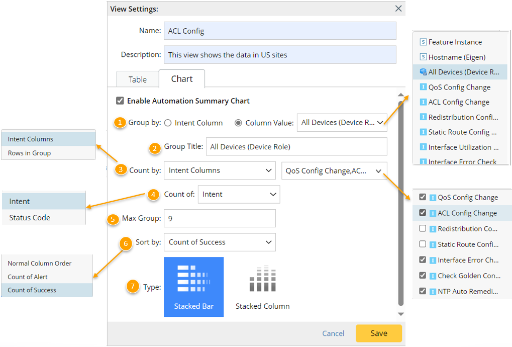
- Group by: In the Group by section, select Column' Value option. With this option being selected, the chart will be grouped by the value of one column selected from all the columns selected under the Table tab. For example, when All Devices (Device Role) column is selected, there are several unique devices in this column, each device will form one group.
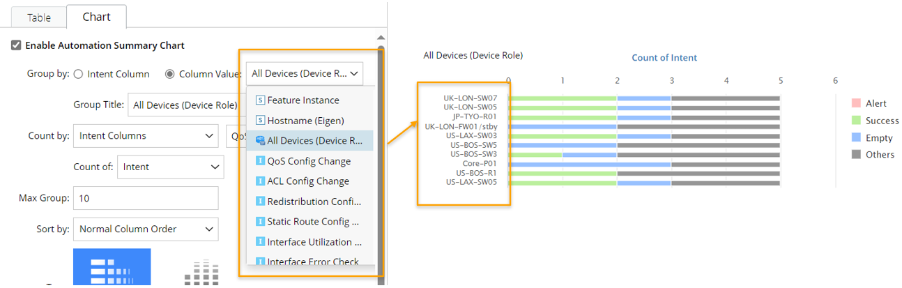
- Group Title: In this section, provide a group title, which will be shown near the vertical axis of the Chart. The default group title will be the column name when the chart data is grouped by column value, and you can modify the group title.
- Count by: In this section, define how the data in each group are counted. In this use case, select Intent Columns, then select some intent columns from the dropdown list close to the 'Intent Columns' option.
- Count of: In this section, further choose what will be counted for the selected intent columns. In this use case, Intent is selected, which means that for each group, the total number of intents in the intent columns selected in step 3 will be counted.
- Intent: Count the total number intents in each intent column group.
- Status Code: Count the total number of status codes in each intent column group.
- Max Group: Define the max number of groups presented in the Chart (default value is 10).
- Sort by: Choose a way of arranging of order of the groups in the Chart. In this use case, Count of Success is selected, which means that the groups in the chart will be arranged according to the number of 'success' in each group in descending order.
- Normal Column Order: Arrange the groups in the order of columns in the original ADT.
- Count of Alert: Arrange the groups by the total number of alert status codes in descending order.
- Count of Success: Arrange the groups by the total number of success status codes in descending order.
- Type: Choose a suitable chart style to present the summary data.
- Click Save, then check the chart shown in the ADT view.
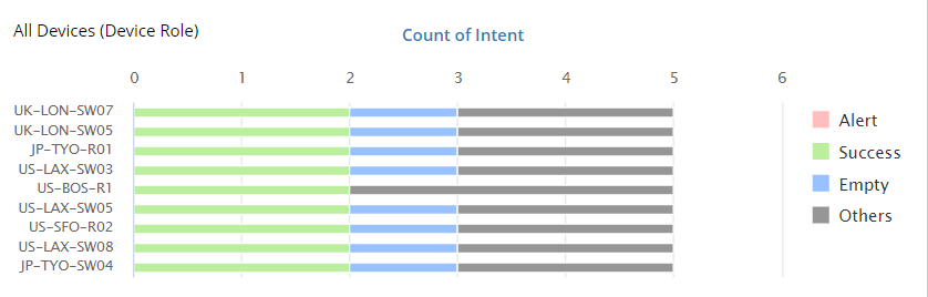
Chart Settings - Use Case 3
Follow the steps below to define Chart settings for Use Case 3.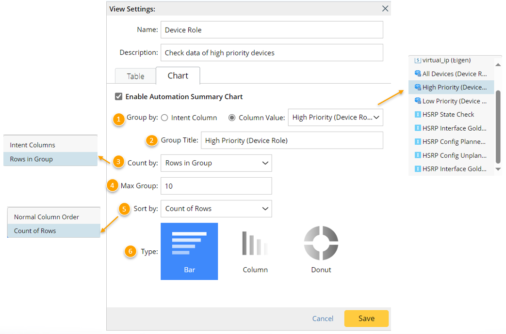
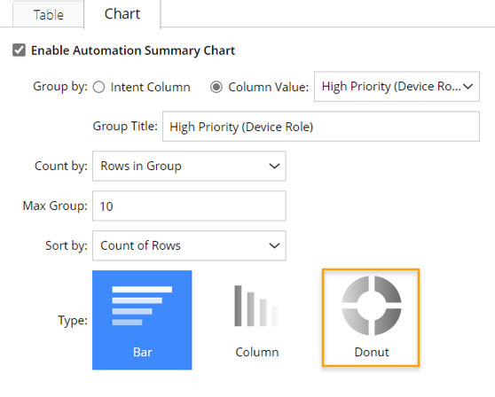
- Group by: in the Group by section, select Column' Value option. With this option being selected, the chart will be grouped by the value of the one column selected from all the columns selected under the Table tab. For example, when All Devices (Device Role) column is selected, there are several unique devices in this column, each device will form one group.
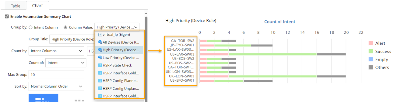
- Group Title: In this section, provide a group title, which will be shown near the vertical axis of the Chart. The default group title will be the column name when the chart data is grouped by column value, and you can modify the group title.
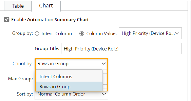
- Count by: In this section, define how the data in each group are counted. In this use case, select Rows in Group, then the system will count the number of rows for each group.
- Max Group: Define the max number of groups presented in the Chart (default value is 10).
- Sort by: Choose a way of arranging of order of the groups in the Chart. In this use case, Count of Rows is selected, which means that the groups in the chart will be arranged according to the number of rows in each group in descending order.
- Normal Column Order: Arrange the groups in the order of columns in the original ADT.
- Count of Rows: Arrange the groups by the total number of rows in each group in descending order.
Note: When Count by 'Rows in Group' option is selected in step 3, only 'Normal Column Order' and 'Count of Rows' can be selected in step 5.
- Type: Choose a suitable Chart style to present the summary data. When Group by ''Column Value' > Count by 'Rows in Group' is selected, ''Donut' chart style is available.
- Click Save, then check the chart shown in the ADT view.
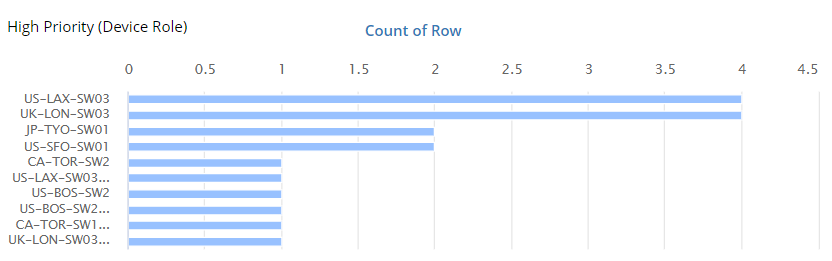
If 'Donut' type chart is defined, the final output is shown below: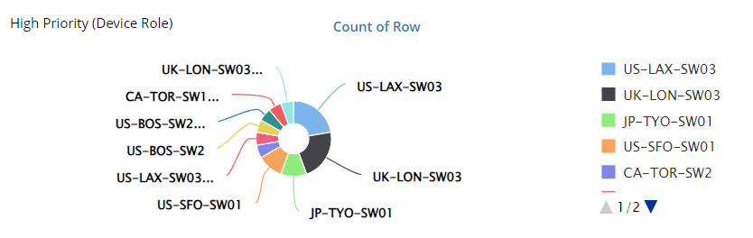
Chart Type
The following table describes the relationship between the “Count by” option and the usable chart type.
| Count By | Chart Type | Sample | ||
| Count by Intent Columns | Stacked Bar |  Tip: The advantage of Bar chart is that it shows a comparison of different values in subcategories. | ||
| Stacked Column | ||||
| Count by Rows | Bar | 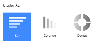
| ||
| Column | ||||
| Donut |