R12.1-JA-2025June05

Define Chart

You can use various charts to display the analyzed result of the Report in Dashboard.

Chart Details

Based on different pivot table settings, Dashboard provides various chart types to display data.

Chart Type UI Annotation for Chart Settings Chart Settings

Line Chart, Bar Chart, Column Chart


  •  The x-axis of the line chart can be one or more of the Pivot Table Rows.
  •  The y-axis of the line chart can be one or more of the Pivot Table Values.
    Information Note: The x-axis and y-axis are reversed between a column chart and a bar chart.
  •  The series of the line chart can be one or more of the Pivot Table Columns.
  •  Check Show Call-out to display call-out on the chart. You can display the call-out on the right or bottom of the chart.
  •  Check Show Legend to display the data legends on the chart.  You can display the legend on the chart's top, right, or bottom.
  • Check Show Data Label to display the data details on the chart.
Gauge Chart
  • The Measure of the Gauge Chart can be one of the grand totals of Pivot Table values, whether the grand total is enabled in Pivot Table.
  • You can modify the data range, colors, and labels for Gauge Chart.


Metric Chart
  • The data of the Fields in the Metric Chart can be one of the grand totals of Pivot Table values, whether the grand total is enabled in Pivot Table or not.
  • You can modify the data, colors, and labels for Measures in Metric Chart.
  • You can add more than one pivot table values as Measures in one Metric Chart.


Pie Chart
  • The Measure of the Pie Chart can be one of the Pivot Table Values.
  • The ‘Sliced By’ of the Pie Chart can be one of the Pivot Table Rows or Columns.
  • Check Show Call-out to display call-out on the chart. You can display the call-out on the right or bottom of the chart.
  •  Check Show Legend to display the data legends on the chart.  You can display the legend on the chart's top, right, or bottom.
  • Check Show Data Label to display the data details on the chart.
Table Chart
  • The Table Chart can display the top N records of the report, where N can be specified by users.
    Information Note: The chart by default shows 100 rows.
  • The Table Chart can be sorted by one of the Report Columns in ascending or descending order.

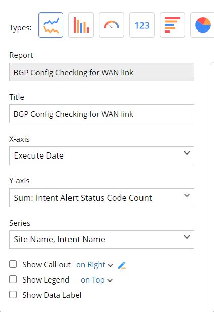
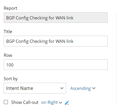
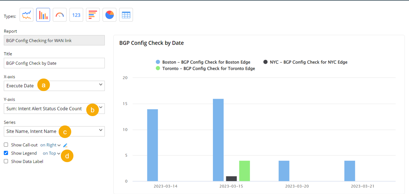
Example: Add Bar Chart to Display Intent Alert Count by Date

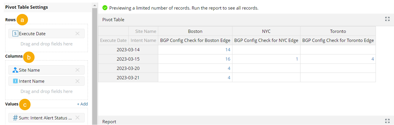
Goal: Add the Pivot Table below as a Bar Chart to display the total number of Intent Alerts by execution date. The Intent alerts are categorized by Intent name and site.

  1. In the report BGP Check for WAN Link, have a Pivot Table ready with the following settings:
    1. Set the Pivot Table rows to  Execution Date
    2. Set the Pivot Table columns to Site Name and Intent Name
    3. Set Pivot Table Values to Sum of Intent Alert Status Code Count
       
  1. In Dashboard, select and drag & drop the report to add a widget.
    Graphical user interface, applicationDescription automatically generated
  1. In the Edit Widget window:
    1. Select the X-axis as Execution Date,
    2. Select the Y-axis as Sum: Intent Alert Status Code Count
    3. Select the Series as Site Name and Intent Name and the chart title to BGP Config Check Alerts by Date.  
    4. Check Show Legend to show the label for data.

  1. Click Save to add the pane.