 by Sep 12, 2018
NetBrain’s visualization and automation platform is built upon a foundation of deep, intelligent discovery. Using not only SNMP but also the CLI, as well as API integrations, NetBrain’s discovery engine builds a data model of your entire network and turns it into a searchable database. This is what enables Dynamic Maps to comprise virtually infinite detail — anything you can discover manually about the network is automatically captured by NetBrain.
All your device, topology, design, configuration, routing, etc., data is embedded within the Dynamic Map. Basically, Dynamic Maps document your network automatically. And because Dynamic Maps are built from live network data, they’re always accurate, always up to date. Further, NMS information is also available (via RESTful APIs) in context on the map. More than a dashboard, a Dynamic Map is an interactive “single pane of glass” where you can actually execute whatever task is at hand.
So how does NetBrain include all this rich data in a Dynamic Map without it becoming a cluttered mess?
Two words: Data View.
Data Views Illustrated
Data View is a layer-based data structure to organize and display various device information. Individual Data Views are essentially customizable device-based “data containers” that allow you to dynamically toggle on or off layers of information — such as data from configurations, CLI commands or other network management systems. Used mainly to decode network design, they are automatically generated for each map. Only Data Views relevant for devices on the current map are shown. Think of Data Views as dynamic substitutes for all the various different sheets in dozens of Visio diagrams.
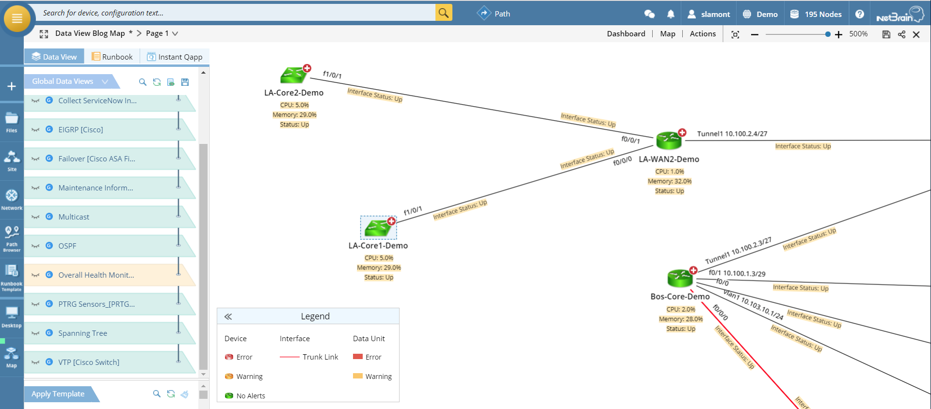
For example, the Dynamic Map below was built around our demo environment’s Boston Data Center core router, expanded to include a few L2 neighbors.
(Click on any image to enlarge.)
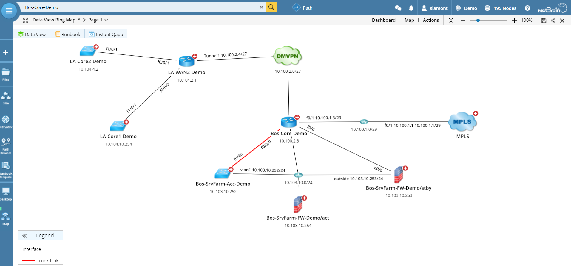
As with any Dynamic Map, zooming in shows more granular details.
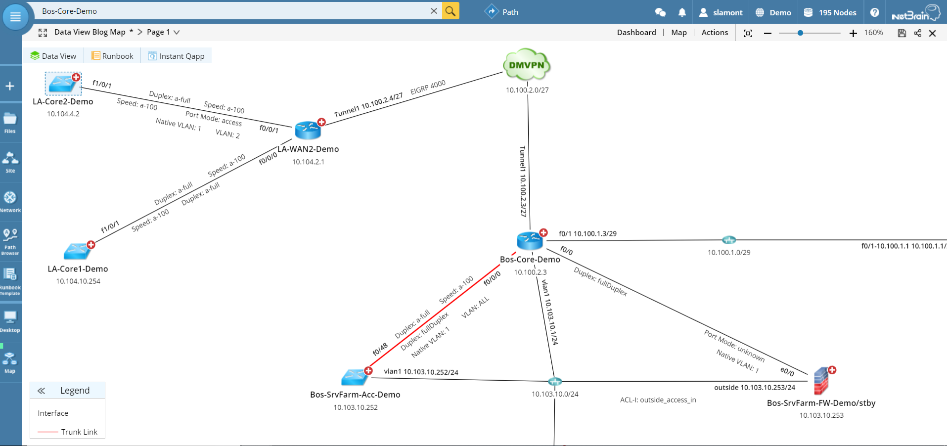
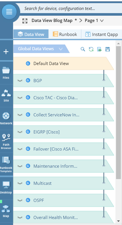
All the Data Views relevant to your map are available in drop-down list.
Design Data Views
But let’s say we want to visualize the BGP configuration. Clicking on the BGP Data View dynamically changes the map to highlight all devices configured with BGP, with speed and duplex information, router IDs, and AS numbers displayed on the map and everything summarized in annotations.
(Click on any image to enlarge.)
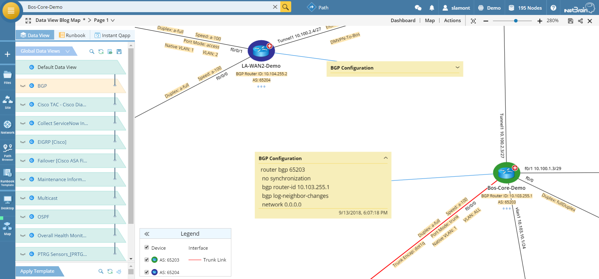 BGP Data View
Or we can toggle off the BGP data and toggle on EIGRP design information. Same map, different data displayed.
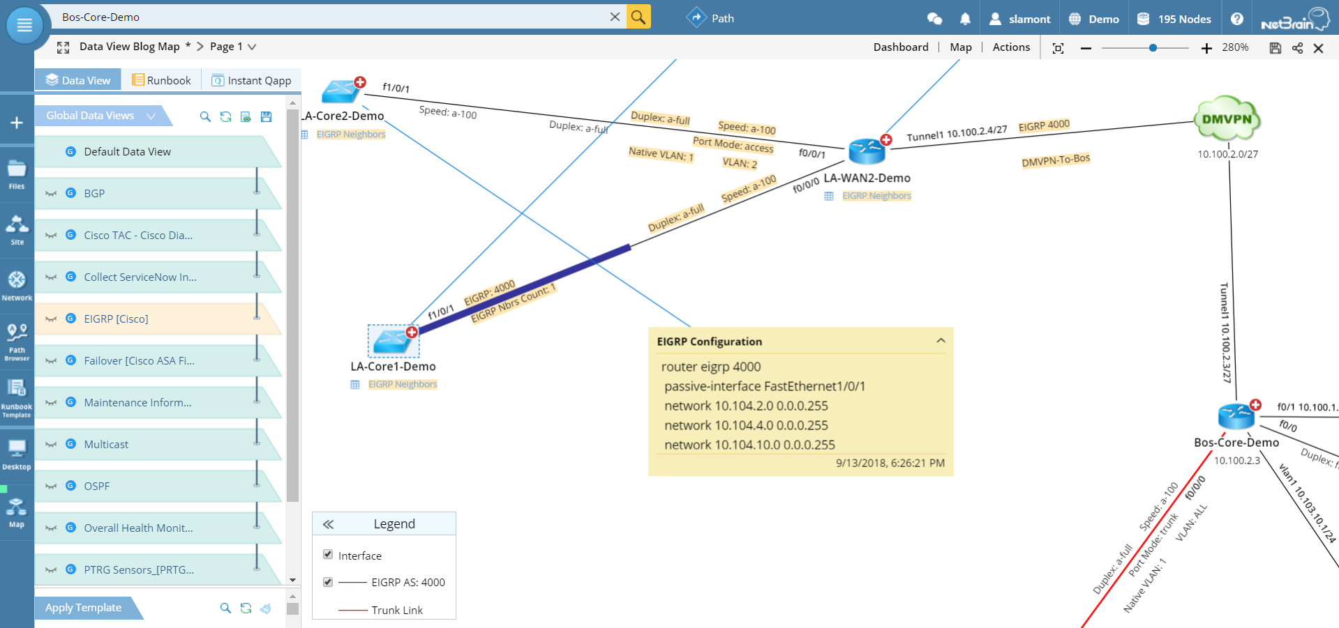 EIGRP Data View
Note the table of EIGRP neighbors that is one-click accessible.
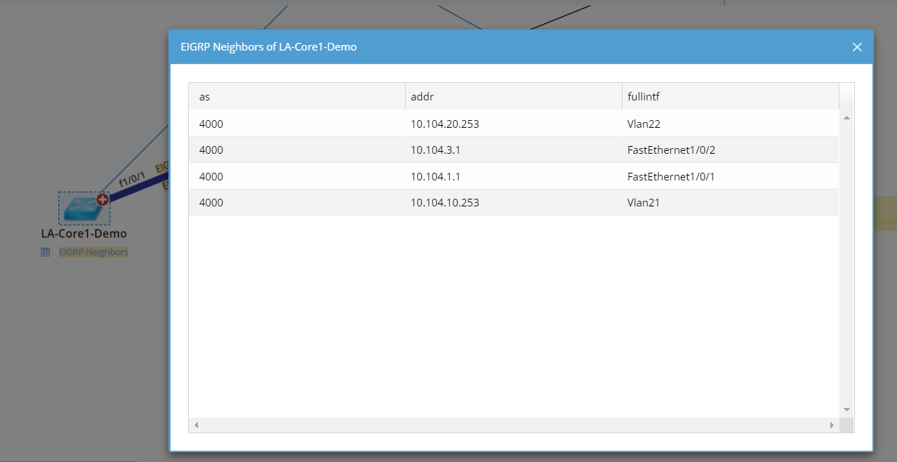 EIGRP neighbors for any device accessible with single click
And you can overlay the map with any design Data View for any technology enabled on any device on the map — OSPF or multicasting or STP, in the examples here. Each Data View displays different information on the map, according to the context.
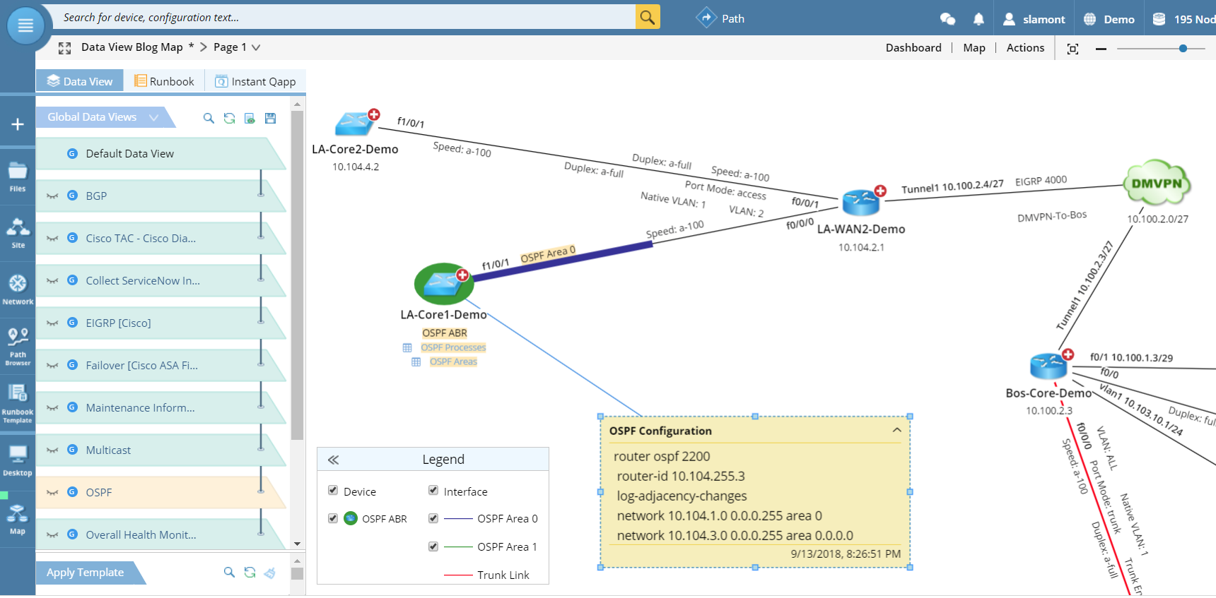 OSPF Data View displays processes and area tables for each device
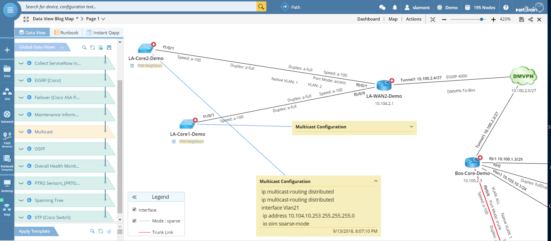 Multicast Data View includes annotations on configuration as well as PIM neighbor tables
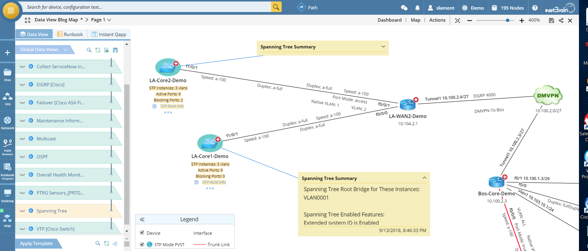 Spanning Tree Protocol Data View
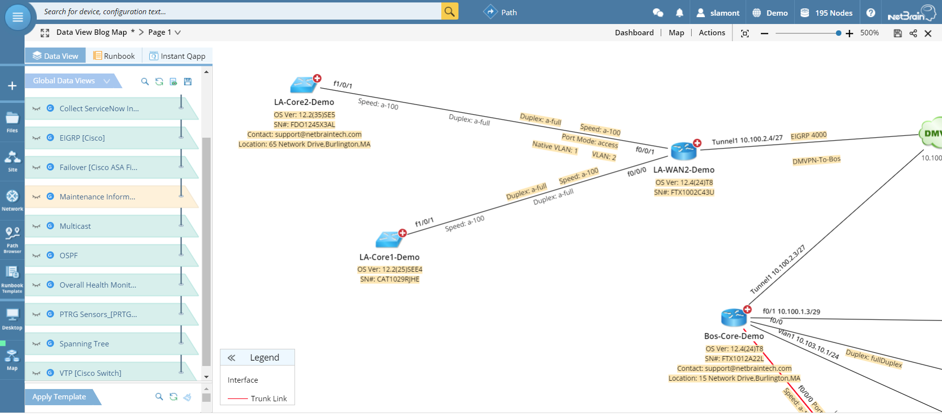
Device Data View
Data Views can also comprise inventory information, such as serial numbers, OS version, location, even contact details.
 Maintenance Information Data View
Cisco TAC Data View
NetBrain and Cisco’s Connected Technical Assistance Center (TAC) program have teamed up on an innovative technology partnership that allows you to leverage the collective expertise of Cisco TAC. We’ve already seen all the data that NetBrain collects from the network. Via API, that data is sent along to Cisco TAC, where it gets crunched through thousands of Cisco scripts to identify known issues. The results of that diagnosis, along with recommended remediation actions, are then available to overlay on a Dynamic Map.
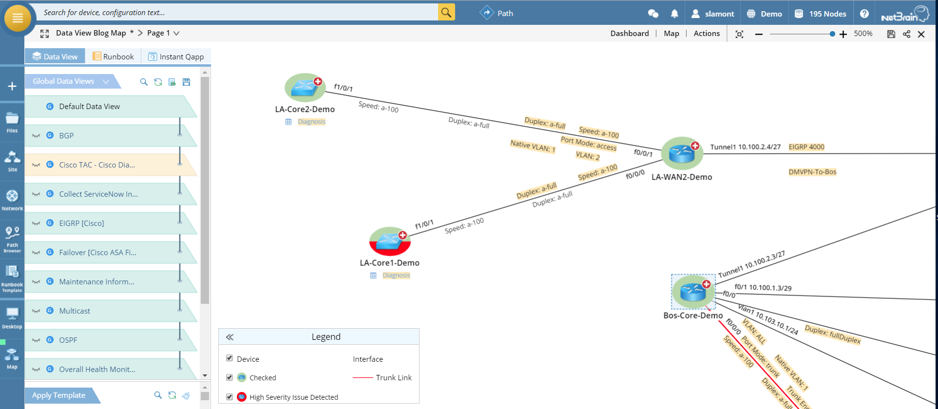 Cisco TAC Data View shows which devices TAC has checked for known problems and flags which devices need immediate attention.
Simply click into the Diagnosis link to see Cisco’s configuration recommendations.
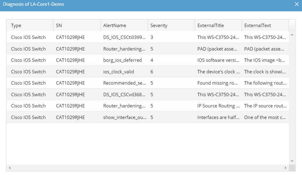 Cisco TAC configuration recommendations
Performance Data View
An out-of-the-box NetBrain Data View called Overall Health Monitor checks device health (CPU/memory utilization) and interface health (up/down, delay and bandwidth utilization). This is a quick way to check in on your network performance — when troubleshooting, for example — without having to jump over to another tool, another screen.
 Overall Health Monitor Data View
Integrated NMS Data View
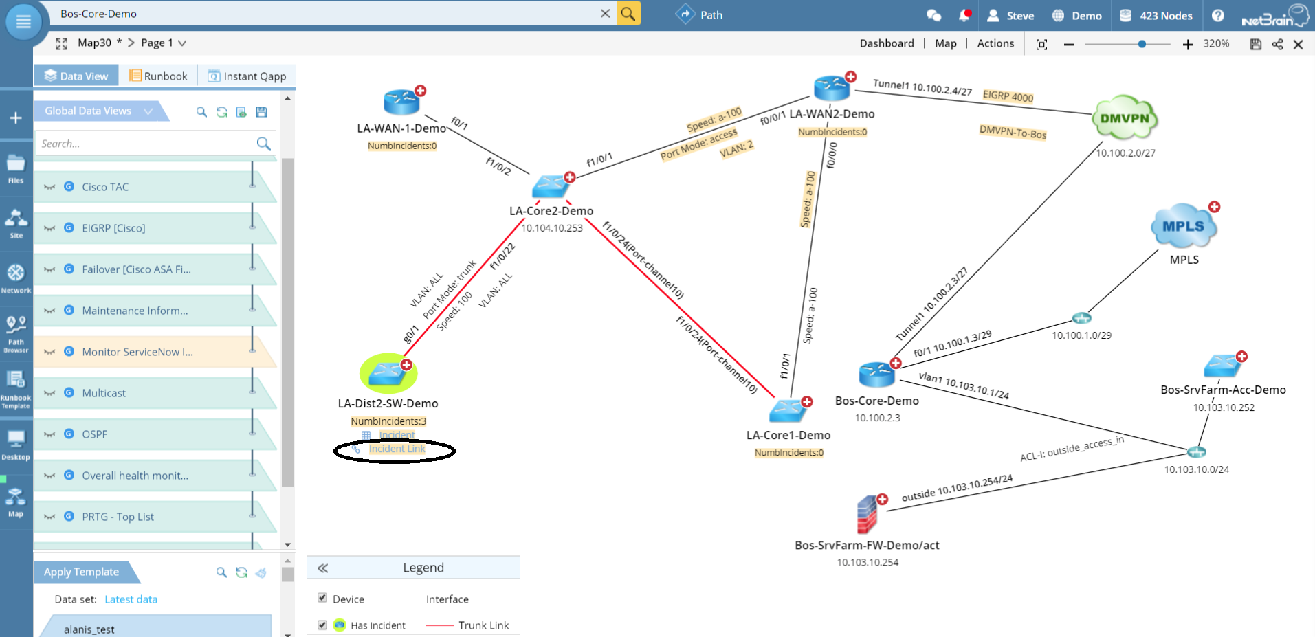
NetBrain Dynamic Maps can visualize any network data from any network management system that has an API. In other words, just about every NMS — that could be a ticketing system like ServiceNow, a 24×7 monitoring solution like PRTG or SolarWinds, or a SIEM like Qradar or Splunk.
NetBrain is able to ingest that external system’s data about relevant devices and display it on a Dynamic Map — with a link back to the system that generated it. And you can customize the Data View based on specific criteria.
For example, toggling on the ServiceNow Data View in our sample map shows that the LA-Dist2-SW-Demo switch has three ServiceNow tickets associated with it. (Devices with incidents are highlighted.) The incident ID numbers are summarized in a clickable table, and there’s a link to the ServiceNow ticket right on the map. Clicking on the link sends you to the incident in ServiceNow itself.
 ServiceNow Data View with link to ServiceNow ticket.
You’ll notice that the ServiceNow ticket already has a link back to the NetBrain Dynamic Map. That’s because when the incident ticket was created, NetBrain automatically built a Dynamic Map around that switch. No human intervention was required. We call that “just in time” automation.
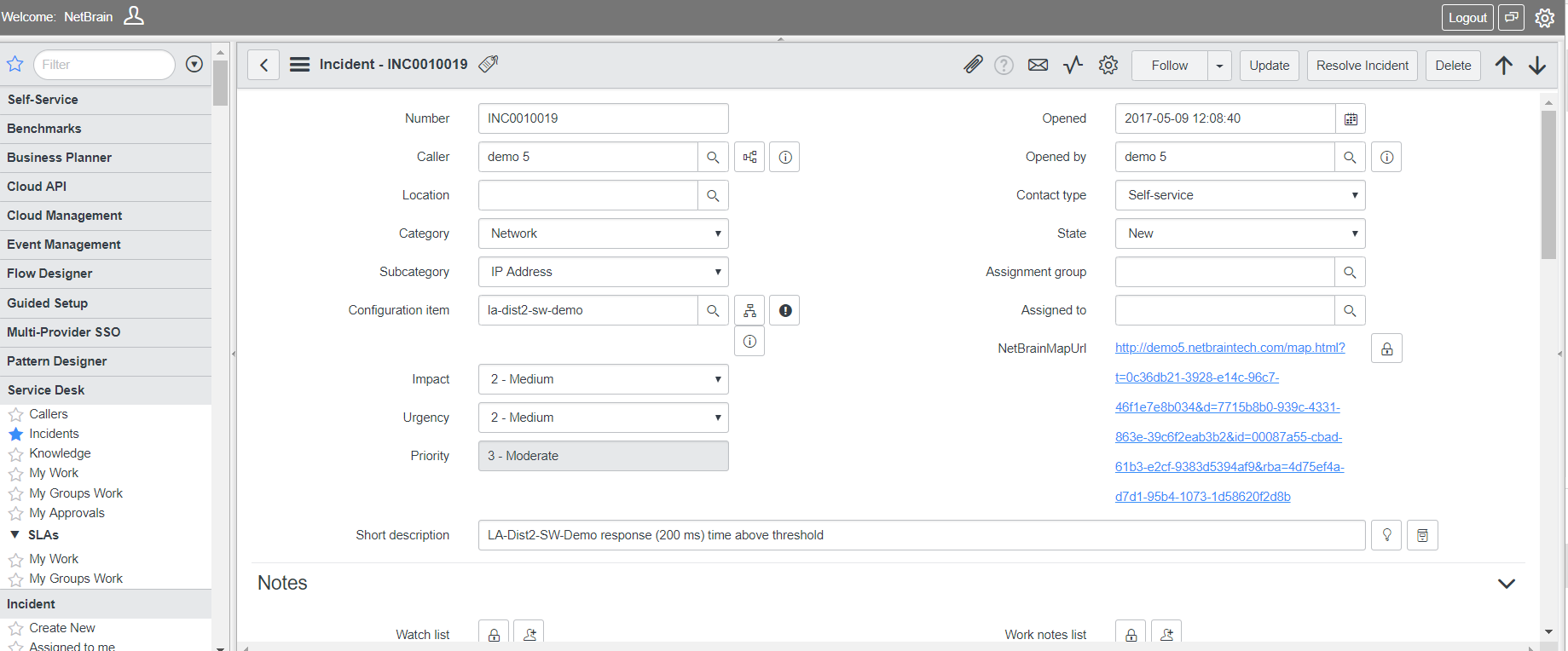 ServiceNow ticket with link back to Dynamic Map
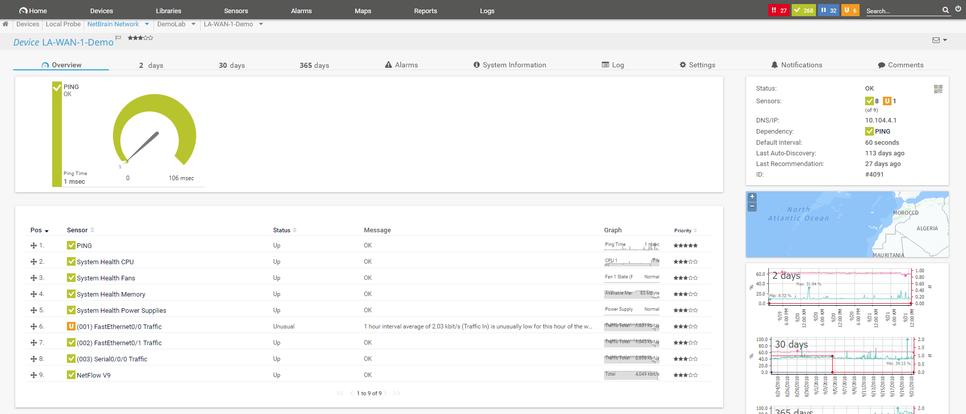
The same capability can be extended to your monitoring tool (here, PRTG). Applying the PRTG Data View highlights all monitored devices, with one-click access to the sensor monitoring information as well as a link to back to the PRTG system.
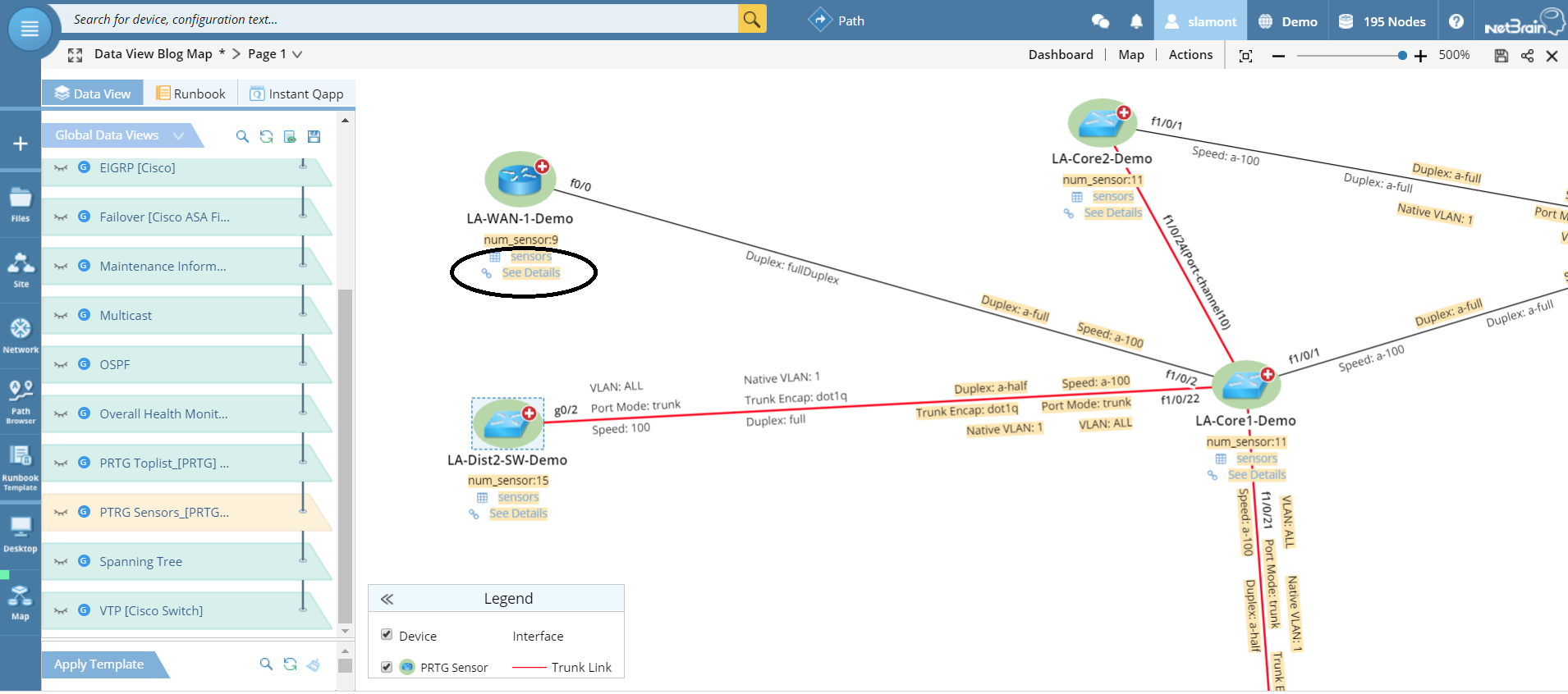 PRTG Data View with sensor monitoring details and link directly to PRTG
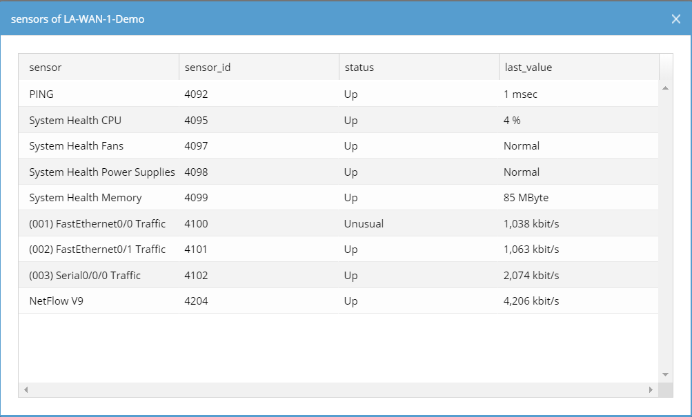 PRTG monitoring data for any device available directly from within the Dynamic Map
 Dynamic Map links to the monitoring dashboard in PRTG for the device in question
Conclusion
Static diagrams contain either not enough information or too much to be useful for the problem at hand. Data Views enable Dynamic Maps to document virtually infinite detail about the network on one single dynamic diagram — without it becoming a cluttered mess.
Data Views let you to toggle on or off different layers of contextual data on a Dynamic Map. They are automatically generated on the fly when you build a Dynamic Map — pulling in data from configurations, CLI commands or external NMS systems. All the various Data Views that are relevant for the devices on the current map are listed in a “table of contents” drop-down menu. Data Views may decode design for a particular protocol (BGP, OSPF, etc.) or show performance metrics or display third-party system information (ServiceNow tickets, Splunk data, 24×7 monitoring details).
You have one-click access to all the data you need, when you need it most, in a single pane of glass.